
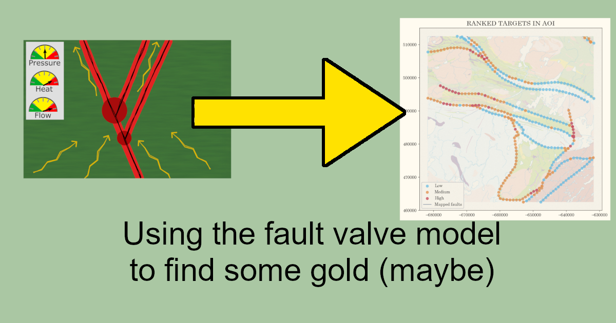
Last week, I wrote about the fault valve model and how useful it is for thinking about orogenic gold deposits. This time I want to try to put some of what we learned to good use and try to find some gold deposits.
Reminder:
1) We are looking for zones of lithological and structural complexity
2) They need to be oriented in such a way so as to reactivate/activate but not *too* easily
3) Within a 50 x 50 km square the character of temperature, stress, and fluid is pretty homogenous MOST of the time
Let’s try it out. I’m going to pick a 50 x 50 km square along a major structure at random from somewhere in Quebec. Then I’m going to apply simply the criteria we developed by extending the fault valve model a little further to narrow down the search space and see how many orogenic gold deposits we can identify.
The plan
To start I’ll separate out major structures in Quebec. To do this, I’ll take the fault geopackage from the inimitable SIGÉOM. Then I’ll dissolve them (so touching structures are treated as single structures) and take only structures that have some gold deposits somewhere. Then I’ll pick a random map square and build up a set of features inspired by the fault valve model, and make some targets. Finally we can compare them to the reality for the map square.
Data processing
First, I will download the data I’m going to use from SIGEOM. We want:
- faults
- showings
- geology polygons
SIGEOM provides geopackages along with a QGIS project with the style info which is great. For this we will be working in Python however so I will style things as I go.
We need to filter down the data to start.
I’ll get rid of the columns we don’t need, then keep only active or closed Au producers as the “deposits”. Keep in mind this is Quebec so for showing codes, GMAU_MF means “gisement minéral Au, min fermé” and GMAU_MA means “min actif”.
Then for geology I know that “NOM_ABRG_ETQT_LITH” is the closest thing to a simple lithology code, and then I will process it a bit more to get just the first code in that long string for simplicity’s sake.
Finally we will import the province outlines, lakes, and rivers.
Here’s the faults and producers:

Distribution of deposits
Gold producers are concentrated in the southwest part of the province along the border with Ontario. There are three main trends:
- Cadillac-Larder Lake fault system (south)
- Porcupine-Destor fault system (north)
- Casa Berardi trend north of the Porcupine-Destor
There are some producers located outside of these areas, but the overwhelming majority (of known deposits) is in the Rouyn-Noranda and Val-d’Or area.
Now we are going to focus on just faults that have some deposits along them so we have a shot at making this work. We will count how many deposits occur along each fault, then divide by their length to get a “deposits per km” value.

Obviously, most faults have zero deposits along them. But out of the good ones, let’s take everything with over 6 deposits per 100 km (0.06 deposits/km) which is about the 80th percentile.

Picking an area of interest (AOI)
Now I will take a 50 x 50 square somewhere along one of those structures at random. This will be the clipping area for the project. Then I use that clipping area to clip out geology polygons, faults, and the base data.

We’re going to pretend we don’t know anything about what area of Quebec that is or anything else and just go in blind. Here’s the geology.

There is lots to talk about, even if we didn’t know what those codes meant or anything else. But for this, I want to just use the ideas we developed last time in a pure form because I think it will be instructive.
Sampling the AOI
Now because we are specifically looking for fault segments, I’m going to generate a series of sampling points along the faults at 1000 m spacing. These points are how we will aggregate the data and generate targets.

Variable: geological complexity
For geological complexity, I will count the number of geology polygons within 500 m of each sample point. Now there is a good case to be made that geological maps get more complex around mineral deposits because that is where we are interested in them, but let’s set that aside for now. Here’s the results of the polygon counting.

Variable: structural complexity
We want to capture the idea of fault intersections and general structural busyness, to represent places where we can get both transient fluid flow but also complexity and perhaps repetitive openings. For that, I will count the number of faults falling within a 2 km radius of the sample point.
Now these are regional fault shapes – there are many more at the local scale. For the purpose of this experiment though we will stick with fewer, bigger faults. In this case, there really isn’t any “low” because every spot has a minimum of 1 fault due to how we built the sample points.

Variable: fault orientation
We want to capture the idea that fault orientation is important, specifically when faults are kind of going against the grain and can build up a lot of fluids before failing. So we want to identify fault segments that are different than most faults in the area (which we can infer formed in a generally favourable way to the last stress regime). The problem is that there usually isn’t just one prominent direction. Let’s look.

We don’t want to do any of this stuff manually, though, do we? It would be fun to repeat this experiment. And it would be fun to do it all over the province. Which means that even if we establish what those mean orientations are for this area, they will change for other places, and we will be forced to keep manually changing it.
Instead, let’s say one thing we can be reasonably sure of is there will be 2 main prominent orientations. That holds together pretty well in my experience, at least in greenstone belts.
So we will make a function to find what those two mean orientations are for any given sample area we study. To do that, we will use a Gaussian Mixture model to find two means that explain the data pretty well. The GMM gives us two means, which represent the peaks in the histogram above. Then we will find the difference between the orientation of each fault segment and those means, and pick the smaller of the two.
And here is what that looks like.

You can see a problem with this, or at least I can. In fact my geological senses are tingling rather annoyingly. I’d be willing to bet that those north-south faults, while very different, probably aren’t covered in gold deposits. I can’t tell you why exactly. I think it’s because we want faults that are still in the big belt-like trends but are say 15 degrees off, not something that is just full on different. I could be wrong, however, but it’s a sign of something we could improve next time around.
Scoring
To score the targets, we will keep it simple and divide each value by the 90th percentile of the population. So a location with twice the value of the 90th percentile would have a score of 2, equal to it a score of 1, half of it a score of 0.5, etc. We are just trying to see what this thing looks like.
Results
Here it is!

Now we can compare it to the currently known past and active producers.

Pretty good for a Friday morning. If we take a 1.5 km buffer around each sample point as I’ve done above, we’ve reduced the search space by around 90% and managed to find two producers.
For those sharpening their confusion matrix knives, just hold on a second. The idea here is just to see what the map looks like when we consider the factors that the fault valve model suggests makes rocks prospective. We also didn’t get overly complicated in building the input features either. It goes to show how far simply considering the geometry can take you.
In addition, what we’ve done here is built a model to represent one way of making sense of a complex problem. And like all models, it should inspire thought about what could be changed or added. In this case we haven’t considered geology beyond just the fault polylines, geophysics, geochemistry, or anything else.
Of course, if you set things up the right way, you don’t need to worry about changing or adding things because it’s going to be easy. You’ll have something that clearly solves your problem, and you’ll be flexible and dynamic as you learn things and move forward. Sounds pretty good, right? As always, if you’re interested in talking more about solving your problems like that, give us a shout any time.