
Recently I started working on a series of videos with Maura Kolb (Unicorn Exploration) about different kinds of gold deposits (check out the video on her channel). Right away we wanted to talk about, OK, what is the breakdown between deposit type and gold production? I thought that would be pretty easy to search for, or look for using an LLM. Well, I was surprised to find that it wasn’t that easy. Most information out there is about production by country, and obviously we can make some inferences from that. But the link to deposit type is a little more tricky.
Just diving into it and straight out prompting Gemini gave me the usual: informative, interesting looking results that weren’t that accurate when I started to compare them to the real data. So I set out to compile my own list to share with anyone else who has the same question as I did. I think this is something that can be a living document too, so I expect to keep updating it as time goes on.
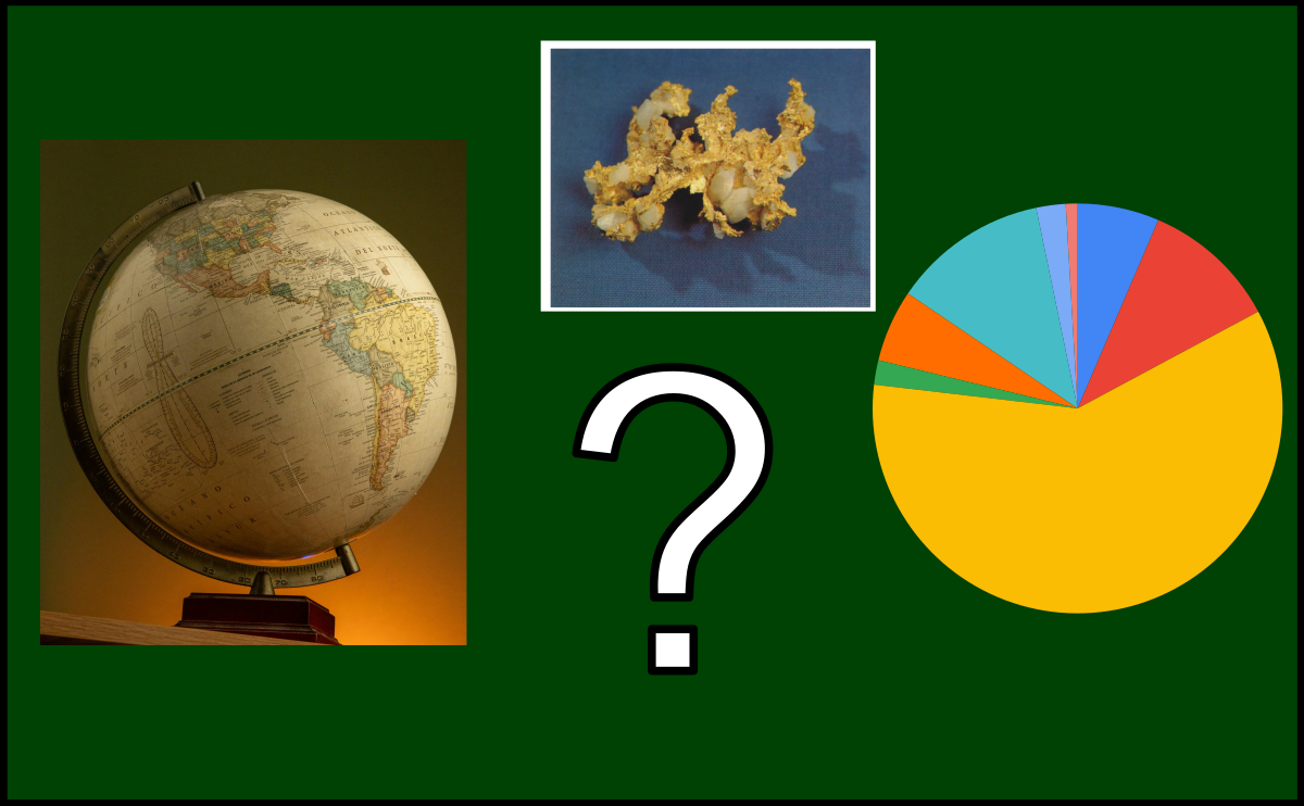
The basics
First I needed a list of countries to look at, and for that I used the USGS Gold report for 2024 (check it out here).
So it’s around 3300 tons total. Let’s look at the breakdown by country.


First of all, that’s a pretty big “other” at 24%, but for reasons we will see shortly it will make sense.
We can already make some inferences here regarding deposit types based on just the geography. For orogenic deposits, I’m thinking about countries with lots of craton like Canada, Australia, Russia, Brazil, or Ghana. For reference there is a good interactive graphic over at the World Gold Council with similar information.
Here’s how that breaks down as a histogram of number of deposits:

The distribution of gold production by country seems to follow a Pareto-looking distribution where most countries produce around 50-150 tonnes per year and a few produce much more. That isn’t too surprising. I usually use it as a rule-of-thumb whenever a dataset emerges from the outcome of many interconnected factors, which happens to be most datasets anyone is interested in.
Diving in
I haven’t actually looked into this question before, but I bet I could make some guesses about what the data is like. Just like the distribution by country, a small number of mines will make up most production, but the rest is made up by many, many smaller mines. Also, I’d guess that we can do a pretty good job of breaking down the distribution by deposit type by just painting countries with a broad brush based on worldwide geology. But before I do that, what types are we actually talking about?
Types of gold deposits
It turns out this might be the trickiest part. Deposit types or deposit models are generally controversial for a variety of reasons, although in this case we will stick to keeping it simple. Here’s a list:
- Orogenic
- Epithermal
- Porphyry
- Carlin
- VMS
- Skarn
- Paleoplacer
- Other
Those are broad enough to be relatively easy to apply, but not too broad so as to meaningless, right?
Well for orogenic deposits, that’s a huge category and there is all sorts of meaningful and important variation within it. That being said, it’s alright. Where one type ends and another begins is a little more complicated. Epithermal and porphyry deposits, skarns too for that matter, are sort of a continuum, so it’s common for a deposit that started as one to end up becoming another as time goes on and the mine expands or understanding changes. Carlin is in there because I feel like I have to have it, although I don’t actually know how important it is globally or if it’s just my North American bias. For paleoplacers, there is generally no mistaking them, and over historical time periods the Witswatersrand deposits must have contributed a huge component of gold production. Nowadays they are proportionally less important worldwide, although of critical importance where they are found. Finally we have Other, a big ol’ other because it includes IOCG deposits like Olympic Dam but also because, at least in the USGS numbers, it includes alluvial/placer deposits which contribute a large quantity of gold. We are going to leave those for another day, but they are worthy of their own deep dive for sure.
Quick estimate: simple country-wide geology
Let’s look back at the USGS table again, and apply some very broad generalizations just based on the geological style of the country:

Just really arm-waving here, but it’s a start. I’m just going off tectonics and how much craton there is. That gives the following breakdown:

Better estimate: detailed breakdown by country
For this, I went out and got data for the top 10 to top 30 producers for each country in the USGS list. There were a couple interesting things that came out of reviewing the data and putting the list together.
Some countries were easy (90%+ of gold is produced in one mine or complex), but some, like Australia and Canada, I had to get 30 producers and it was still maybe 50% of the production. A long tail in action: most of the production is from a bunch of big deposits, but there are many more smaller producers. Look at the histograms of producers by size for Australia and Uzbekistan.


That’s because almost all Uzbek production comes from the gigantically productive Muruntau deposit (orogenic, but it’s complicated) followed by the also-mammoth Kalmakyr deposit (porphyry). In Australia, on the other hand, there are some big producers (Boddington, Tropicana) but there are also many more “smaller” ones (Fosterville, Gwalia). There is a whole interesting side story connected to how these mines are funded and operated that helps explain this – a post for another day, perhaps.
It wasn’t easy to stick a label on many of the deposits, a recurring theme. Where do you draw the line between epithermal and porphyry, old porphyry and orogenic, etc.? This is another question, and certainly one that is pretty philosophical. Much has been written about the value of deposit models and paradigms for exploration, but at the end of the day for most of the deposits (and typically the larger ones), companies mine first, and ask questions later. I think the empirical approach of focusing on mineralization style and geometry has been effective for much of mining history, and will continue win the day. That being said, I’ve filled out deposit type as I see fit based on the framework above.
On to the results.
Distribution of tonnes per producer
First I wanted to look at the histogram of production per producer, to see if it looks like the very high level by-country data from the USGS.

Kind of. If I were to fiddle with the bin size a bit, we would probably see a little normal-looking part of the distribution below 5 tonnes per year. Instead we are seeing the long (long!) tail of very large producers here instead. Most producers are sub 5 tonnes per year, but a significant proportion of the total gold comes from larger ones.
Production by deposit type
What’s the most productive deposit type?

Orogenic was the clear winner, and the back-of-the-envelope ratio of about 50% orogenic, 25% porphyry and epithermal, and 25% everything else holds together pretty well.
How about my initial estimate?

Not bad! I overestimated porphyry and underestimated epithermal, but if you add them together it’s pretty close.
Production by country and deposit type
This one’s a little harder to visualize. There’s a couple deposit types that are almost country-specific: Carlin for the US, paleoplacer for South Africa. Other than that the breakdown comes down to tectonic style and whether or not there is craton.

Summary
So there you have it.
One thing that’s come out of this for me is, like so many times in my experience, this is really a problem that is answered with a database. In fact, if we can imagine a database of mineral deposits that includes the kind of information I collected here, it’s easy to imagine the query that could build the above charts for us. The design and construction of something like that is precisely the sort of information and journey I want to showcase here. I find if people see the kind of problems that can be solved by starting with tidy data, they can see the value of putting in that upfront work themselves. Looking forward to sharing it.